We hope you enjoy learning about this principle!
Find out more in our main article: This is how sustainably websites can grow.
Can’t see the woods for the trees.
The principle of designing from patterns to details means starting with primary designs and recurring forms. These can be found all around us – in nature, in our relationships and in our workplace. Take a step back, observe these patterns and consciously acknowledge them. Initially, it doesn’t matter whether the patterns relate to design or behaviour. Process patterns could potentially lead you to practical solutions to problems, whereas design patterns or natural forms could provide you with an aesthetic approach. The key is to start by looking at the bigger picture without getting caught up in the details.
First create patterns
- How is your site structured? What is the basic framework?
- Think about the user journey and design it efficiently. Create characters to help you understand your users better. Consider your users’ key objectives and your main conversion goals – prioritise these things.
- How do users interact with your site? Create a user journey map to look at all the touch points.
- Develop a well thought-out, consistent design. Define basic elements and apply them consistently. For example, decide on a global colour scheme to use for all links and buttons. Planning your design well at the start will save you a great deal of work later.
- Follow the lean startup principle and focus on essential core functions so you don’t get carried away with too many different features. You can continue to develop your web project in cooperation with users at a later date.
Think modular!
Finding the right pattern is more important than understanding all the details.
By focusing on complex details, we run the risk of not being able to see the wood for the trees. When planning large-scale projects, this can result in designs that look impressive but don’t work. Complex systems that are self-adjusting and durable are usually based on simple or modular systems.
Then design the details
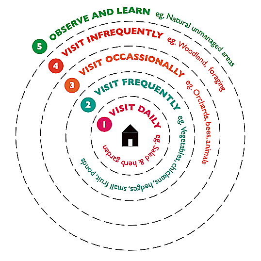
Permaculture applies the concept of zoning. This involves dividing up areas so that the most frequently visited zones are easiest to access. Correspondingly, the zone which is visited least frequently is located furthest away from the main zone. The areas are also arranged according to the amount of attention and care required. This method aims to optimize paths and increase energy efficiency. It can also be applied to arranging information on a website in a meaningful way and can be used to develop the details of the information architecture.
This diagram illustrates how a plot of land is zoned (and there are actually more similarities to a website than you might expect). The herb garden, which is used on a daily basis, is planted right next to the house to save time and effort.
- Decide which content is particularly important - and which is not – and use this to develop your menu structure. For example, if your website’s main goal is to raise funds, don’t hide the donation page in a submenu!
- Take a user-centred approach: Try role-playing situations and put yourselves in your users’ shoes to discuss which content is most important to them.
- Which information should be easily accessible? Make sure this is clearly visible on your home page. You can also add calls-to-action buttons to the page header or footer.
- So what should you do with niche content? This doesn’t usually require subpages and an unnecessarily complicated menu. You could include this kind of in-depth content in your blog.
Now you know one of the 12 principles of permaculture webdesign.
Want to find out more?
Go to the permaculture principle 8 oder return to the main article This is how sustainably websites can grow!

